

Fresh Directions for New Scents
Key Visual Rescue, Touch-Activated Line
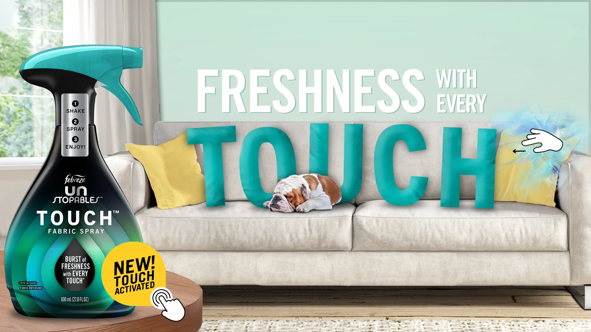
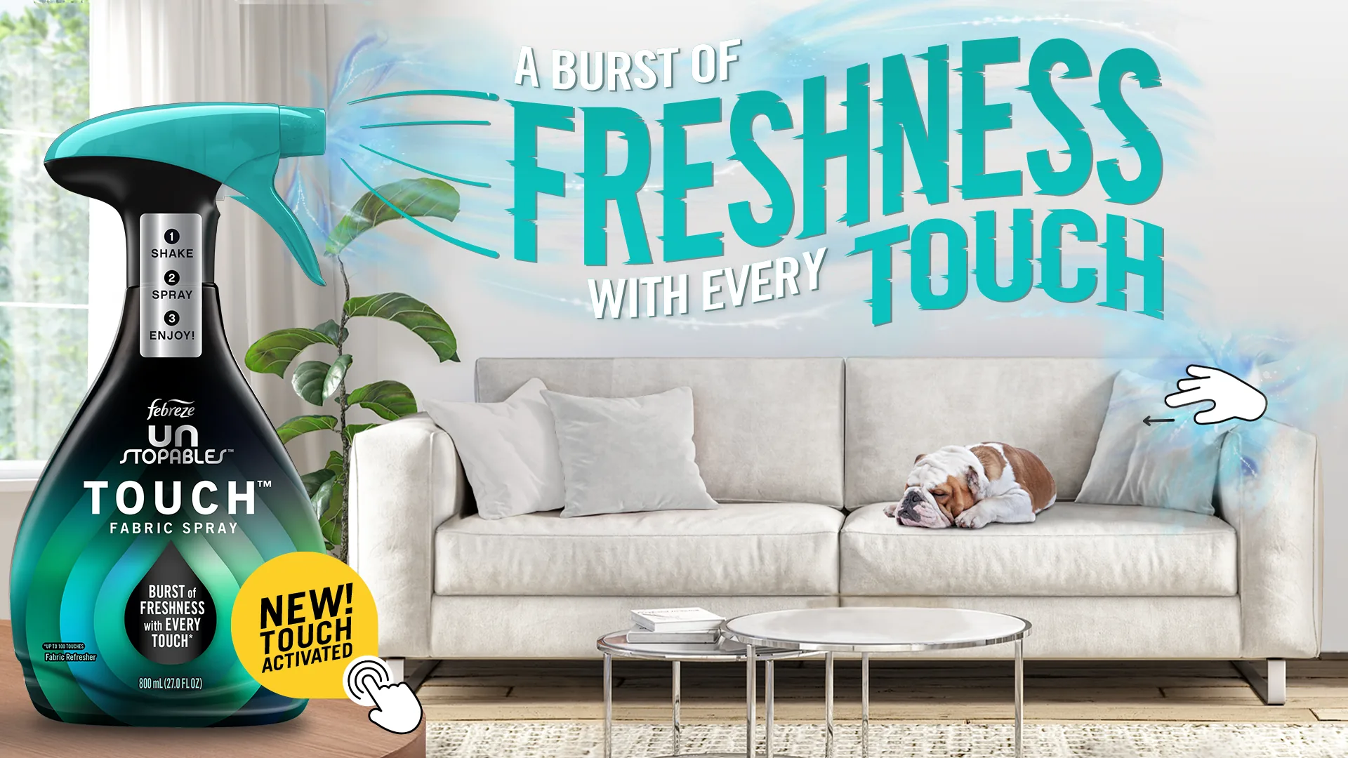
- Art Director: stepped into a stalled key visual and redirected it in a single design rodeo
- Designer: pushed the typography and composition instead of restarting the concept
The original key visual had already gone through several rounds with another team by the time I came in for a quick “design rodeo.” Instead of starting over, I looked at what wasn't landing in the existing concept and pushed the typography and composition.
The redirected visual got approved quickly by the Group Creative Director and led to them adding me to the launch team.
Launch One, Element Line
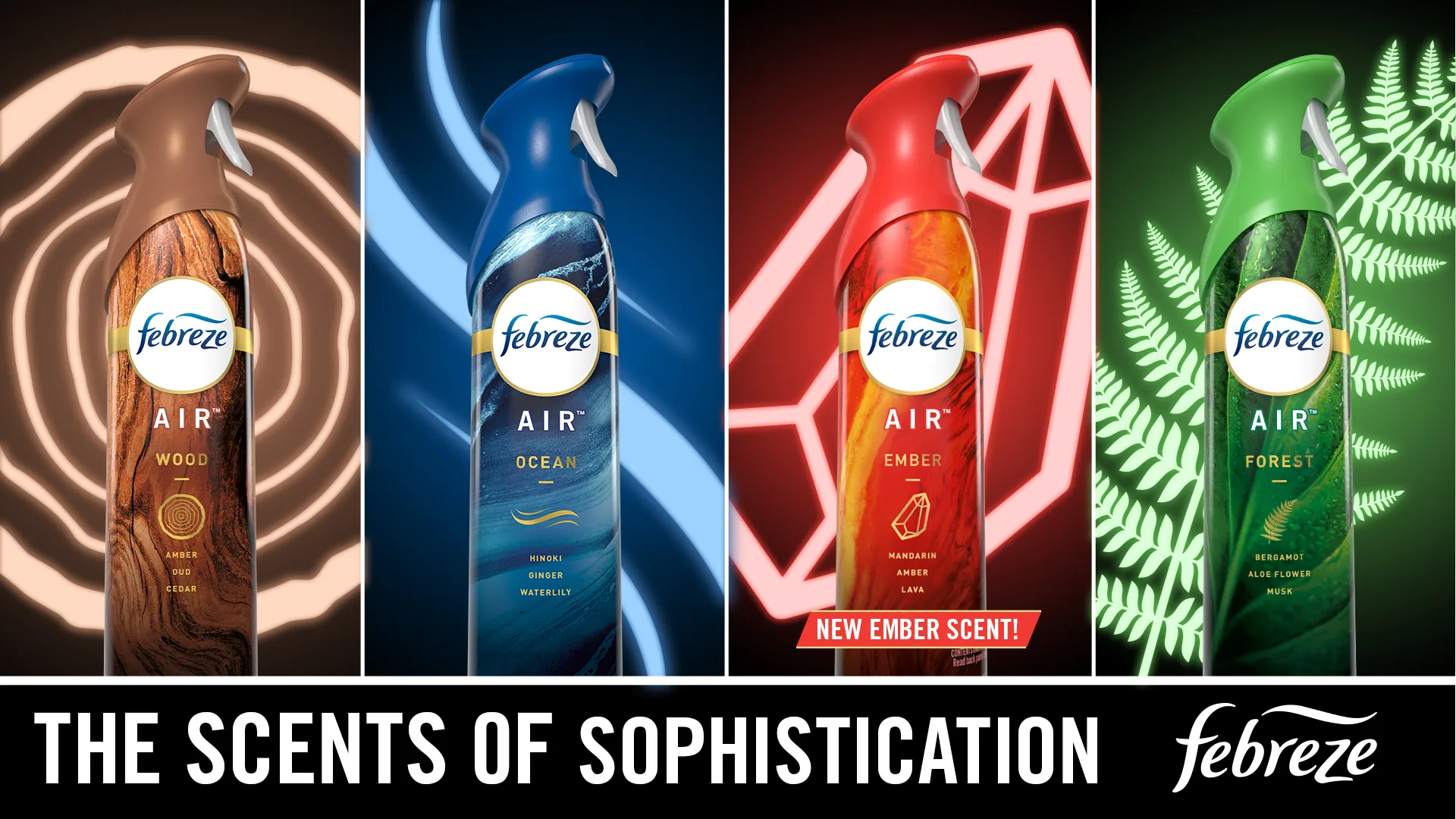
- Art Director: shaped a moody, stained-glass visual language around the four elements
- Designer: built the icon-led layout system that kept the line feeling premium
- Creative Partner: worked directly with copy to keep image and message moving
A new scent line based on 4 elements, aimed at a more masculine audience. With a couple of concepts playing on the power of the elements, the emotions of the elements, and the final option that leaned on the new icons and the idea of an almost church-like stained glass look. Playing off that moody, relaxing feel of a dark world bathed in light, to highlight how these scents were designed to feel.
Immediate approval from the client at sketch phase.
Launch Two, Spring Line
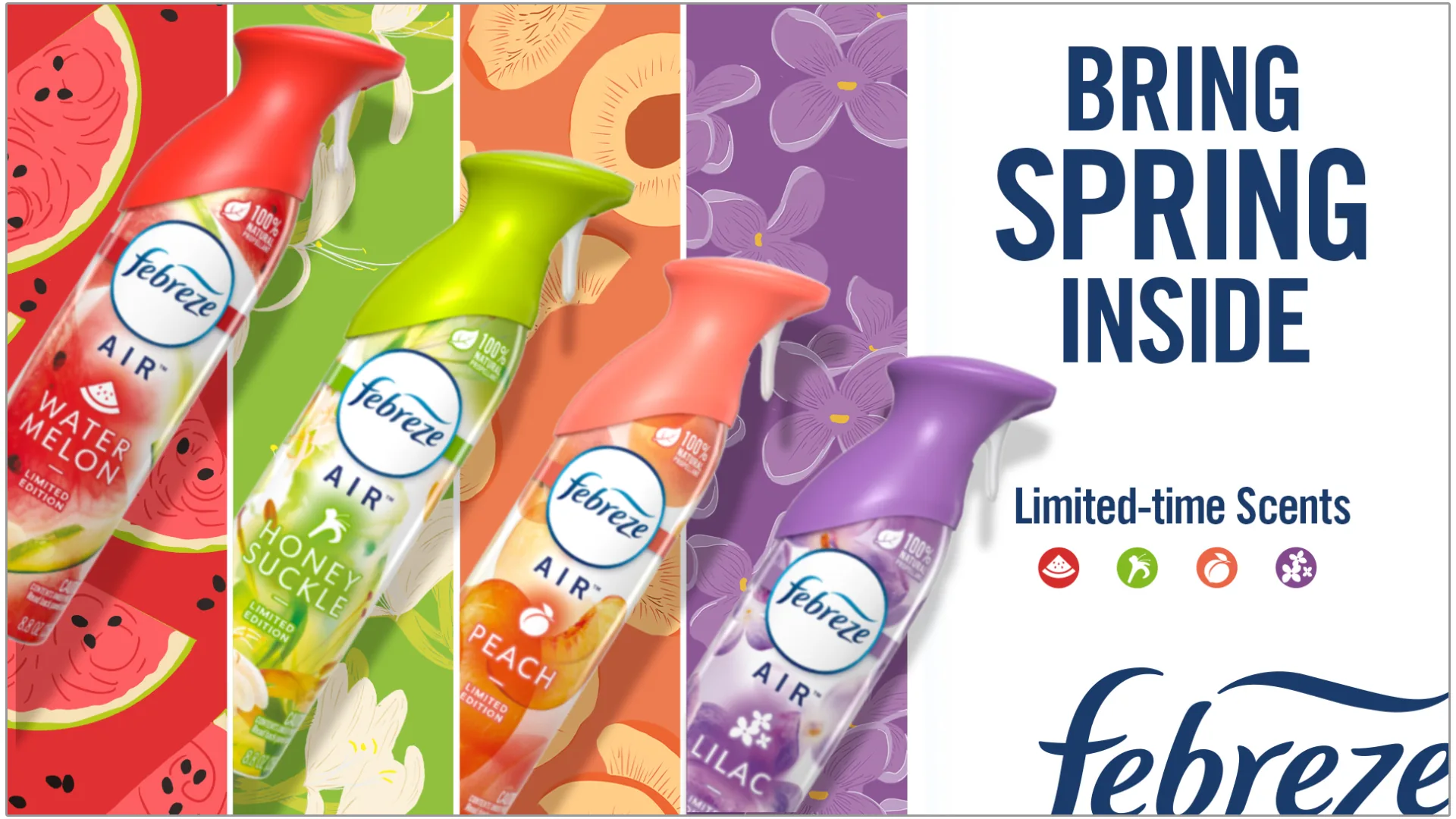
- Art Director: turned the spontaneous DIYer insight into a livelier spring visual language
- Illustrator: created the botanical artwork that gave the spring line its own identity at shelf
- Producer: carried the line from concept through final production-ready art
At the same time, Febreze was gearing up for a spring launch with more eccentric scents targeting a more spontaneous, creative, feminine audience. With the insight of our spontaneous, crafty DIYer, the idea was inspired by that energy and the Brady Bunch. I built out original illustration highlighting different botanical artwork for a livelier layout.
GCD and Febreze loved this idea, leading to a full build-out and my illustration being used in the final assets.
Key Visual Rescue
Brought onto the ongoing Febreze launch team
Key Visual Rescue
Rounds already attempted before the rescue
Launch One
New scent-line launch directed from the rescued direction
Launch One
Purchase-intent lift in concept testing
Launch Two
New scent-line launch directed alongside Launch One
Launch Two
Purchase-intent lift in concept testing